MAREA ↗
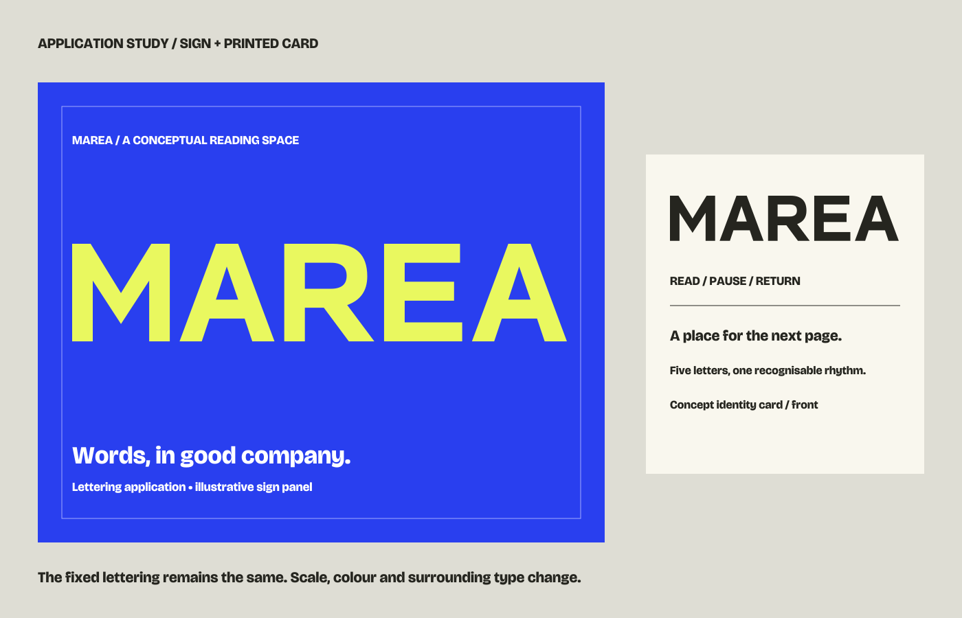
LetteringA five-letter name constructed around repeated diagonals. Follow the choices from first directions to small-scale and reversed applications.
Independent design / Madrid, Spain
I’m Beñat Juaristi Elias. I work with lettering and typography: the particular character of a name, and the way a page invites you to read.
Explore the studies ↘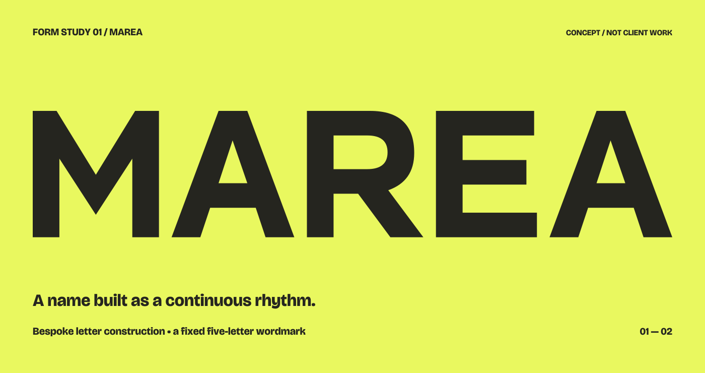
A word is never
only a word.
The shape carries a voice. The spacing creates a rhythm. The surrounding information gives both a purpose.
Two self-initiated studies explore different questions. One draws a fixed name; the other gives a programme a coherent reading order.
A five-letter name constructed around repeated diagonals. Follow the choices from first directions to small-scale and reversed applications.
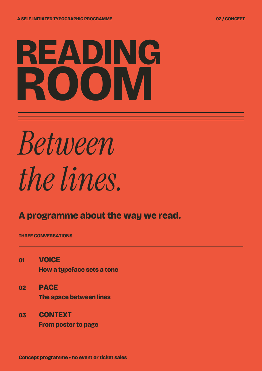
A poster needs to announce; a booklet needs to sustain attention. See the same typographic voice change pace across a programme, spread and narrow screen.
A small experiment in reading
A few points of size or a little more space between lines can change an entire paragraph. Try your own words in the type lab, compare wide and narrow measures, and print a specimen to discuss.
Open the type lab ↗01 / A particular word or name
When the letters themselves need attention: proportions, joins, rhythm and the relationship of a fixed set of characters. The same word may need different arrangements or refinements for its intended use.
Explore lettering decisions →02 / A composition made to be read
When several kinds of information need to work together: a title, supporting text, a sequence of pages or a change of format. Hierarchy and spacing make the content easier to approach.
Explore typographic decisions →The wording, audience and smallest intended use are better starting points than a list of visual effects. Tell me what needs to be read, and where.
Start a conversation ↗Or prepare your brief first →