Study 01 / self-initiated concept
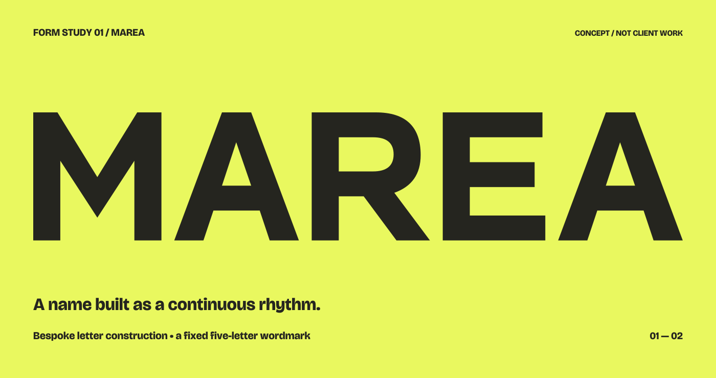
MAREA
A fixed name, drawn as a connected rhythm. An original lettering exercise in diagonals, open counters and the interruptions that make a word recognisable.
- Question
- How can unlike letters feel related?
- Demonstration
- Bespoke five-letter construction, scale and applications.
- Context
- A conceptual reading space; no real organisation or commission.
- Type credits
- Supporting type uses Bricolage Grotesque. The MAREA mark is drawn from original paths.
The conceptual brief
Quiet enough to repeat.
Distinct enough to remember.
Develop a five-letter name for an imagined reading space. It should remain clear as a broad sign and as a smaller printed mark. The aim is a coherent silhouette, without making every character identical or adding an unrelated symbol.
Development / alternatives
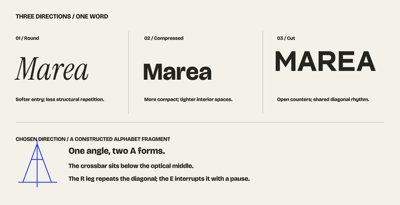
Three directions.
Different kinds of energy.
A softer type-led route suggests a more conversational voice. A compact sans route creates density. The constructed route builds its rhythm from repeated diagonals and open spaces. The last direction offers the clearest structural idea for this exercise.
A shared diagonal
The M introduces two rising strokes. The A repeats that movement and the R leg returns to it. Repetition gives the word a family resemblance without forcing a diagonal into the E.
A deliberate interruption
The E adds horizontal bars between the R and final A. It acts as a pause. Preserving that contrast makes the rhythm more readable than repeating the same gesture in every letter.
Refinement / size and colour
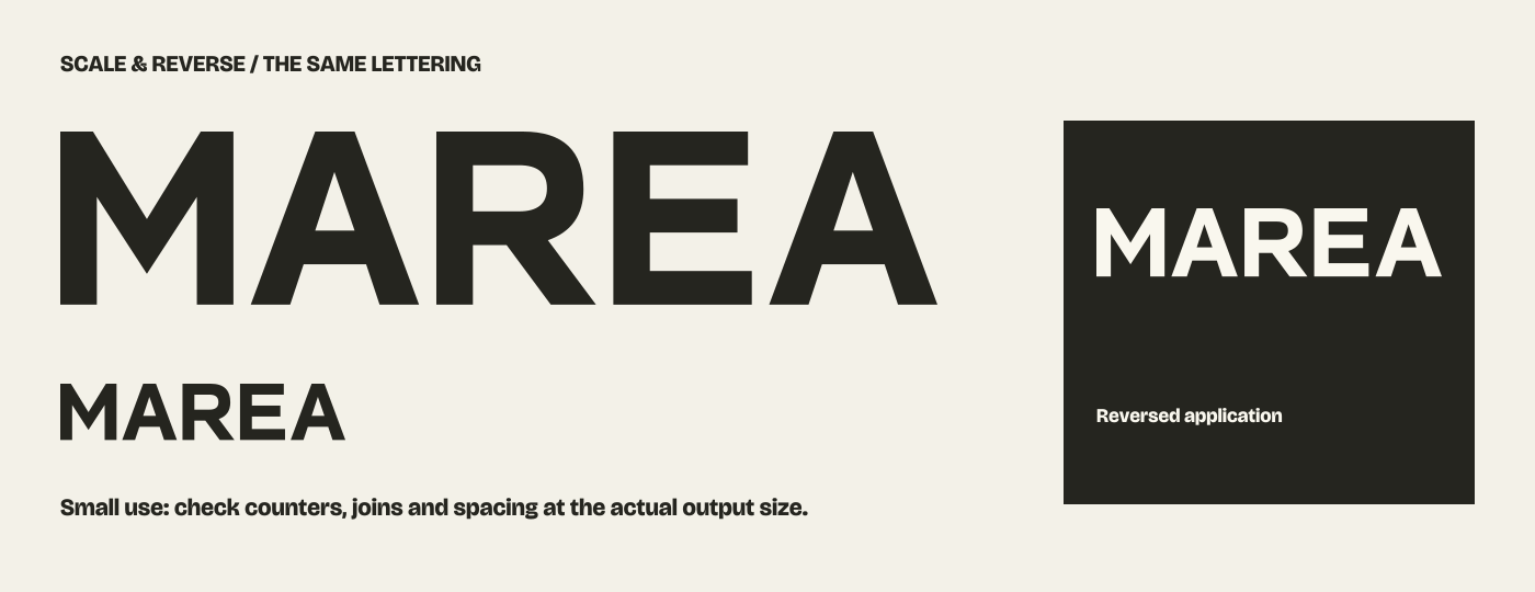
Judge the spaces
inside the shapes.
The two A counters and the R bowl remain open. The R leg leaves a distinct wedge beside the E. At a small size these relationships need their own check; a large, impressive rendering alone is not enough.
Application / a full composition
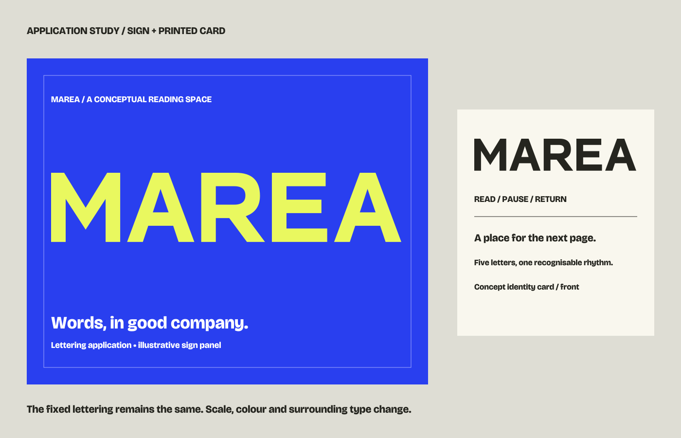
The name is only
part of the message.
The sign gives the mark room to announce itself. A smaller line explains the conceptual setting. On the card, the same lettering sits with supporting text and a horizontal rule. Scale and space do the organising; the mark is not redrawn for every placement.
What a commission would still need
Actual wording and language, intended locations, smallest reproduction, production method, colour requirements, versions and agreed usage rights. Sign fabrication, printing, trademark clearance and an installable font are not implied by this lettering demonstration.