Study 02 / self-initiated concept
Reading
Room.
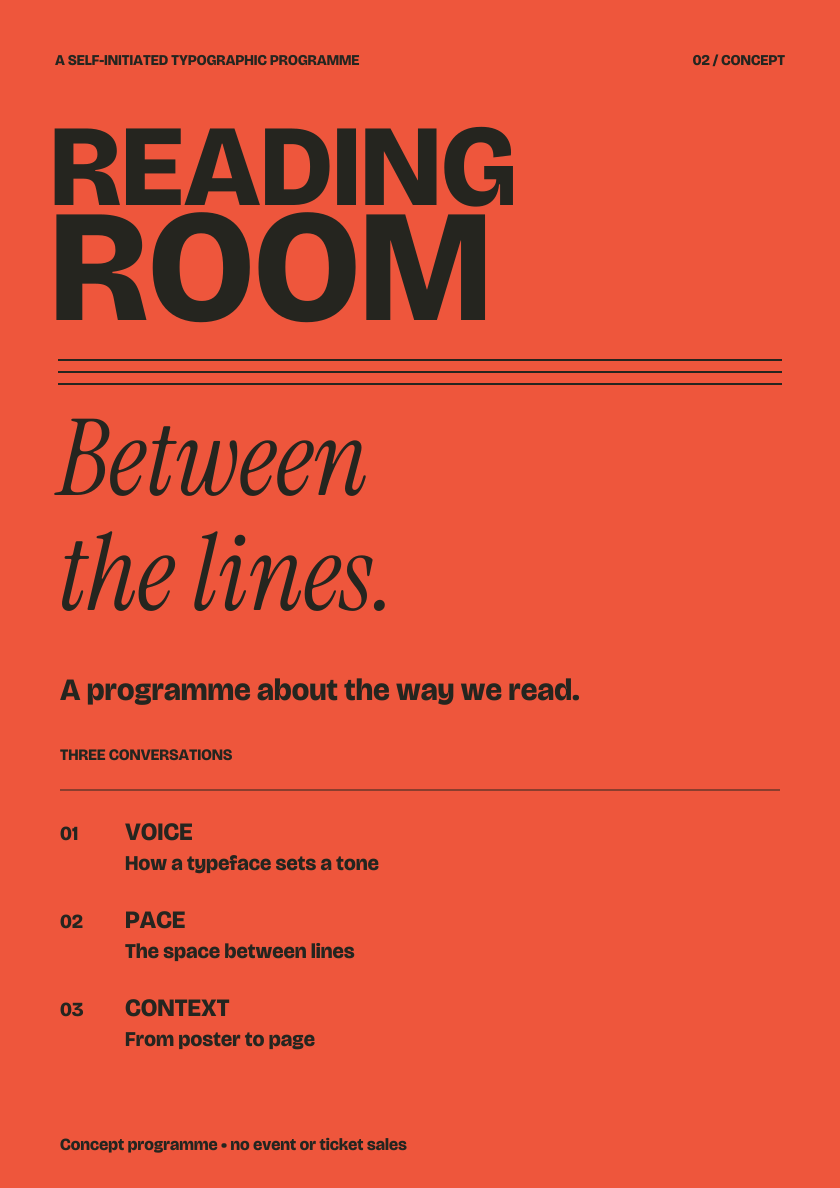
A conceptual programme about reading. A title announces, an italic voice invites, and the supporting information creates a usable sequence.
- Question
- How can one voice change its pace?
- Demonstration
- Complete poster, editorial spread and narrow programme layout.
- Context
- An imagined programme; no actual event, organisation or ticket sales.
- Type credits
- Bricolage Grotesque and Instrument Serif Italic, licensed under SIL OFL 1.1.
The conceptual brief
Announce first.
Invite a closer look.
Arrange a title, a subtitle and three conversation topics. The poster should hold together at a distance, then reward a closer reading. The same voice should continue into a booklet without giving every sentence the volume of a headline.
The coral field, large sans title and slower italic subtitle establish three distinct layers. A simple sequence of numbers makes the programme easy to follow.
Development / hierarchy
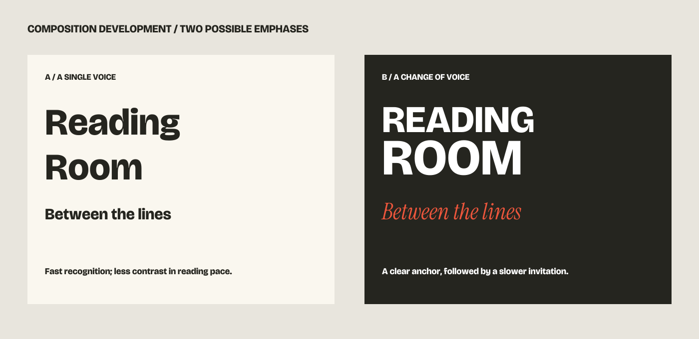
One voice,
or a conversation?
A single sans family offers restraint, but the title and subtitle begin to share a similar pace. A serif italic introduces a different texture. The chosen contrast gives the title a firm anchor and the subtitle a softer invitation.
Where contrast earns its place
The serif is reserved for the invitation and selected editorial emphasis. Session names and practical sequence stay in the sans family. Each role has a reason, so the composition does not become a catalogue of type effects.
What remains consistent
Left alignment, a controlled palette and repeated rules hold the contrasting voices together. The supporting information keeps a clear order rather than competing with the title.
Application / sustained reading
A poster calls.
A page makes room.
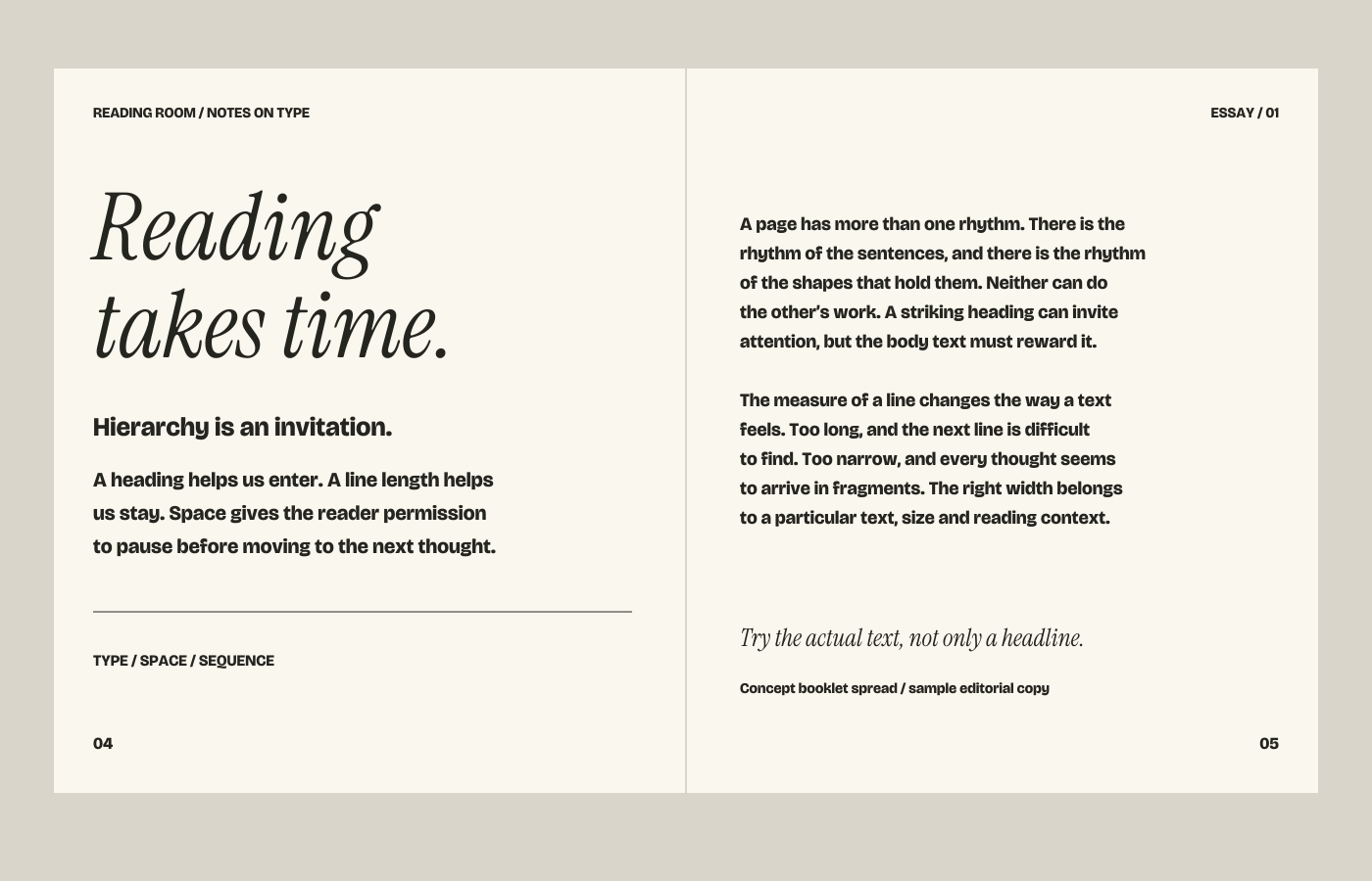
The booklet reduces the scale of the announcement and introduces a more regular reading measure. Running heads, page numbers and a quiet rule establish orientation. The wider margins let the italic heading breathe while the body text carries a separate rhythm.
Test the actual content
The longest heading, real paragraph lengths, accents and numbers can change the design. A final publication also needs checks for proofs, output settings and reading conditions. This screen illustration demonstrates hierarchy; it does not certify a print-ready edition.
Application / a narrow measure
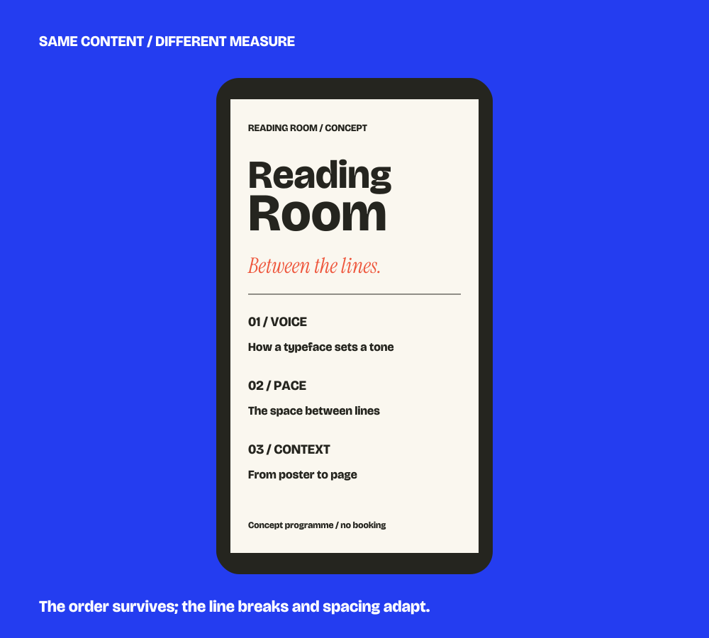
The order survives.
The breaks can change.
The programme moves into one column. Title, subtitle and numbered topics keep their roles, while their proportions and spacing adapt. Preserving the exact poster line breaks would make the narrow version harder to read.
Try this relationship yourself: in the type lab, use the narrow view and change size or leading. The useful question is whether the content still reads comfortably.
Open the type lab →