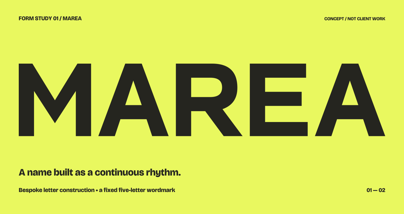
Begin with the
exact wording.
The letter sequence is a design constraint. “MAREA” repeats an A and moves between a diagonal M, a rounded R and a horizontal E. Changing the word would change those relationships. That is why approved spelling, accents, punctuation and language should be established early.
A lettering enquiry should also identify where the word appears: a cover title, a sign, a label or another intended application. These are contexts to discuss, rather than a universal bundle of deliverables.
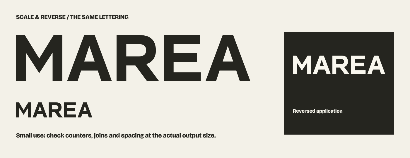
A form must work
at the right scale.
A delicate join can be attractive at a large size and fragile when reduced. A narrow counter may close in a small print. Reversed lettering can appear heavier against a dark background. Actual size and production conditions are more useful than judging only a large screen preview.
- Proportions: wide, condensed or more compact forms change the overall silhouette.
- Spacing: the shapes between letters matter as much as the letters themselves.
- Variants: a stacked arrangement, single-colour version or small-size refinement should be identified if needed.
Explore alternatives
with a reason.
“More character” can mean several different things: a more open counter, a sharper diagonal, a quieter ending or an unusual relationship between two letters. Useful feedback identifies the intended effect and context rather than adding decoration to every character.
The number of directions and revision stages belongs in the proposal. An agreed development process should distinguish exploration, a selected direction and refinement of that direction. A change in wording or intended use may require revisiting earlier decisions.
Agree what you
will receive.
Discuss the approved wording, master artwork, colour versions and any alternate arrangements. Vector formats can be useful for a fixed mark; raster exports may be useful for particular placements. The exact file types and whether editable working files are included should be specified rather than assumed.
Lettering for one name does not imply a complete alphabet or a font that can type other words. Usage rights, exclusivity and any trademark clearance also need their own discussion. The example artwork on this site is a study, not a design offered for adoption.
See a word
take shape.
The MAREA study follows a self-initiated name from different visual directions to a construction system, then to sign and card compositions.
Follow the MAREA concept →Discuss your wording ↗