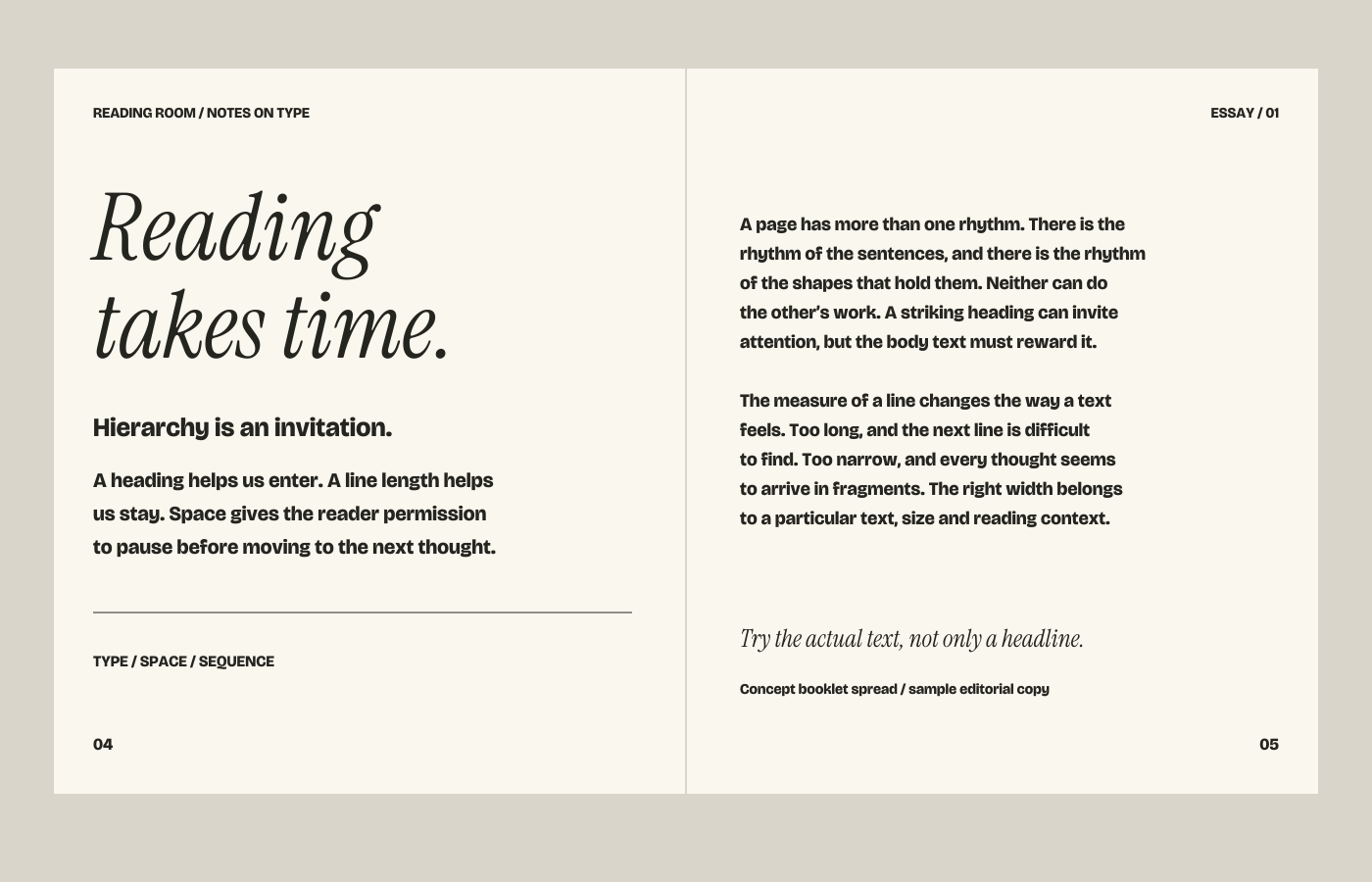
Hierarchy is
more than size.
Making the title bigger is one way to establish priority. Weight, position, spacing, colour and a change of typeface can also direct attention. When all of these signals compete, the page becomes harder to navigate. A useful system uses enough contrast to distinguish roles, then repeats those roles consistently.
Content should arrive with its intended sequence and relative importance. A programme with three sessions asks for different decisions from a long essay or a cover with a single line. Placeholder text can hide the difficult line breaks and awkward lengths that the actual content will introduce.
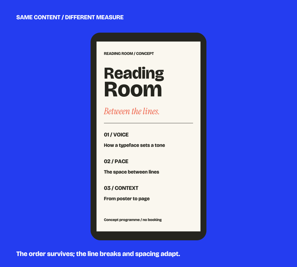
Give each format
its own measure.
The same typographic voice can adapt without preserving every line break. A wide poster can hold a broad title. A narrow screen may need the title to stack and the supporting information to move into a simpler sequence. A booklet can sustain longer reading with a more restrained hierarchy.
- Type size and measure: evaluate line length together with the size of the text.
- Leading: enough space to follow a line, without breaking a paragraph apart.
- Tracking and contrast: judge words and paragraphs at the intended size, not only at enlargement.
Type choices
carry responsibilities.
A typeface choice involves more than appearance. The required languages, accented characters, numerals and symbols must be available. The licence must cover the intended use, including any web, app, document embedding or sharing that the project requires.
Font files are not automatically transferred with artwork. If you already use a type family, identify the version, licence holder and applications. If a new family is considered, the relevant permissions and purchasing responsibility should be settled in the project agreement. Underlying typeface design is distinct from the design of a composition.
A handoff should
match the next use.
Discuss whether the result is a finished layout, a family of layouts, an editable template or guidance for someone implementing the work. Each has a different handoff. Page sizes, bleed, colour settings, output formats and font availability should follow the actual production or implementation requirements.
A composition shown on a screen does not prove print quality or accessibility in every use. Check the final content, contrast, smallest sizes and intended reading conditions. Agree who performs production proofs, implementation and any further testing.
Try a paragraph.
Then see a system.
The type lab makes size, line spacing and tracking visible. The Reading Room study shows those decisions working across a complete poster, booklet spread and narrow layout.
Experiment in the type lab →Explore Reading Room →
Discuss the content and formats ↗